End-to-end app


Role: UX/UI designer
Industry: skincare and beauty
Duration: 12 weeks
Tools: Figma, Miro, Illustrator and Photoshop
In recent years, skincare has evolved from a simple routine into a widely popular form of self-care, especially among younger audiences. Social media platforms like Instagram and TikTok are flooded with product reviews, tutorials, and ingredient deep-dives, sparking curiosity but also overwhelming many users.
Despite this boom, most people (especially beginners) struggle to build a consistent routine. The abundance of advice creates confusion, doubt, and wasted money on products that don’t work for them. A 2023 survey by Mintel revealed that over 70% of skincare users feel unsure about which products are right for their skin type.
01/ Main task & challenges
Problem statement
How might we use AI to create a skincare mobile-app that simplifies information, delivers personalized guidance, and helps users confidently build routines tailored to their needs?
Business goals
Increase product conversion and long-term engagement, build trust through a helpful, intuitive experience and gather user insights to improve recommendations.
The users
Skincare users seeking simple, personalized routines. They want clear guidance, trustworthy recommendations, and help understanding how to use products correctly.
The solution
An end-to-end mobile app powered by AI that scans the user’s face to analyze skin conditions, recommends personalized skincare routines, and adapts over time. Glow Guide simplifies product choices, offers guided support, and builds user confidence through tailored, data-driven recommendations based on real-time skin analysis.
Research process
To truly understand the skincare experience from a user’s perspective, I conducted qualitative research combining:
Competitor analysis
5 in-depth user interviews, ranging from complete beginners to experienced skincare users
These interviews revealed several recurring themes and helped uncover pain points, motivations and habits that shape how people care for their skin.
01. Simplicity is key
Users are looking for a basic but effective daily routine, not a 10-step ritual.
02. Top concerns
Hydration, signs of aging, dark spots, and breakouts were common pain points from a skincare perspective
03. Credibility matters
Dermatologists and professionals are highly trusted. Social media not so much.
04. Guidance over complexity
Users feel overwhelmed by too much information and conflicting product recommendations. They crave personalized, expert-backed support in one clear, easy-to-use platform.
05. AI is welcome
Users showed enthusiasm for an AI-powered app that could suggest personalized routines, explain ingredients in simple terms and track progress over time
02. Smart Routine Builder
Based on the scan results, users receive a daily skincare routine with product recommendations that match their specific needs—no guesswork required.
04. Education Hub
A content-rich space offering dermatologist tips, articles, tutorials, and ingredient guides—designed to make skincare accessible, trustworthy, and easy to understand.
Core app features
To address the main challenges users face when navigating the world of skincare—information overload, product confusion, and lack of personalized advice—I focused on a set of core features designed to provide clarity, simplicity, and tailored support. Each one is built to help users feel confident, informed, and empowered in their skincare journey.
01. Face scan and quiz
Users complete a simple face scan and short skin quiz to generate a personalized routine tailored to their skin type, concerns, and goals.
03. Progress Dashboard
A visual dashboard helps users track changes in their skin over time and see how their routine is working, encouraging consistency and reflection.
02. NICE TO HAVE
User reviews: show reviews from real users filtered by skin type and concerns, helping to make informed decisions
Routine reminders: remind users to follow their daily skincare routine.
Seamless E-commerce integration: allow users to purchase recommended products directly from the app
Reapplication tracker: track product shelf life and remind users when to replace or reapply products
Ingredient compatibility checker: check product compatibility to prevent mixing ingredients that could irritate the skin
Multilingual support: support for multiple languages to cater to global users.
Feature set
01. MUST HAVES
AI-powered skin analysis: analyze the user's skin from a picture (selfie, video)
Log in / sign up
User profile: save and edit personal info, preferences, allergies, routine history, etc
Onboarding flow: skin type quiz or onboarding questions to personalize the experience
Custom routine builder: create personalized skincare routines based on the user's skin type and needs.
Educational content and expert tips: provide accessible, easy-to-understand explanations from dermatologists and skincare professionalsE-commerce links or in-app purchase integration
Smart product suggestions: suggest personalized products based on the skin analysis and user preferences.
Progress tracking: track the user’s progress over time with photos or notes
User personas
I used affinity mapping to group user insights and uncover recurring themes. These patterns allowed me to define three primary user personas, each representing a key segment of the skincare audience:

Persona 1. Young and impulsive, she loves trying the latest skincare trends—especially if they’re aesthetically pleasing. While drawn to what's popular, she still wants simple, easy-to-follow routines.
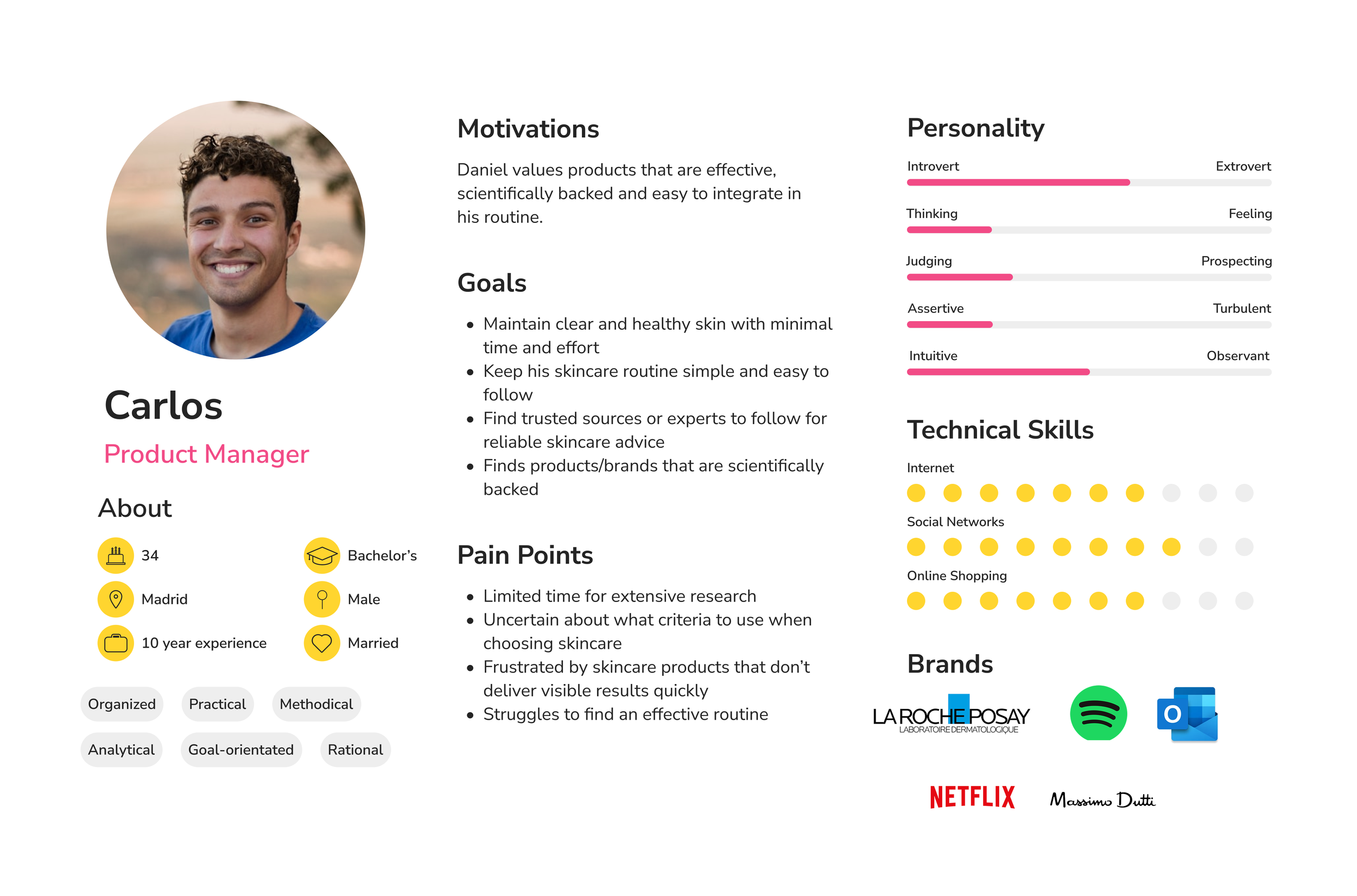
Persona 2. Focused on results, he looks for effective, science-backed products. He prefers a straightforward routine and values function over branding or packaging.
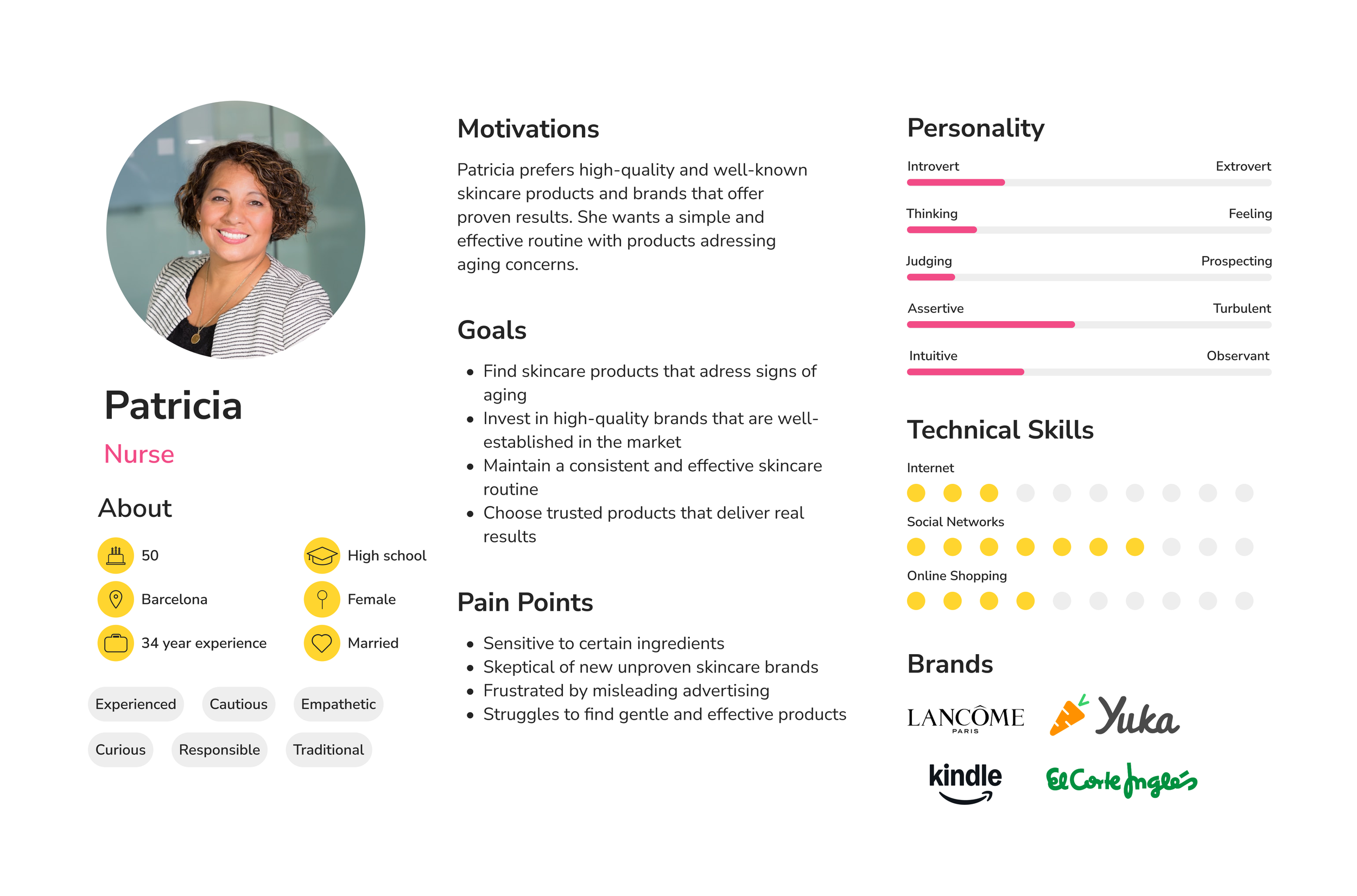
Persona 3. A middle-aged user loyal to trusted brands. She’s cautious about trying new products and seeks clear, reliable guidance backed by experts.
Information architecture
Using the personas as anchors, I mapped the core user flows, focusing on solving real problems having in mind the key features

Design
With a clear vision of user needs and app flows, I stepped into the design phase.
01.
Hand-drawn sketches
Branding
02.
Low-fidelity wireframes
03.
Visual design & brand identity
04.
High-fidelity wireframes
05.
User testing and iteration
Once the layout was defined, I developed a brand identity that reflects the product’s mission: to offer clear, supportive, and trustworthy guidance, just like a reliable skincare routine. I built a modern and approachable visual system, choosing a pastel blue as the primary color to convey calmness, freshness, and confidence, values often associated with self-care and well-being.
For typography, I selected two complementary fonts: a bold and modern primary typeface to bring personality and strength to the brand, paired with a softer, highly legible secondary font to maintain a friendly and professional tone. The combination of soft colors, rounded UI elements, and contemporary typography creates a design that appeals to a younger audience without losing credibility, much like skincare products that are both trendy and trustworthy.

Usability testing & iteration
To evaluate the usability of the app, I conducted moderated testing sessions with five users. Each participant was guided through key tasks:
Completing a facial scan and answering onboarding questions
Browsing the suggested routine and adding it to their profile
Browsing though the discover and resources section
Key findings & design improvements
Based on feedback, I made several key changes:
Improved navigation between screens for smoother flow
Added product tags like “vegan” or “for sensitive skin” to help users filter options more easily
Included more detailed explanations for each recommended product to help users understand why it fits their skin
Refined visual elements like toggles to improve clarity
The testing process confirmed that Glow Guide was intuitive, helpful, and engaging for users across experience levels. It also helped ensure the app aligned with user expectations and genuinely solved their pain points.

03/ Improved visual elements
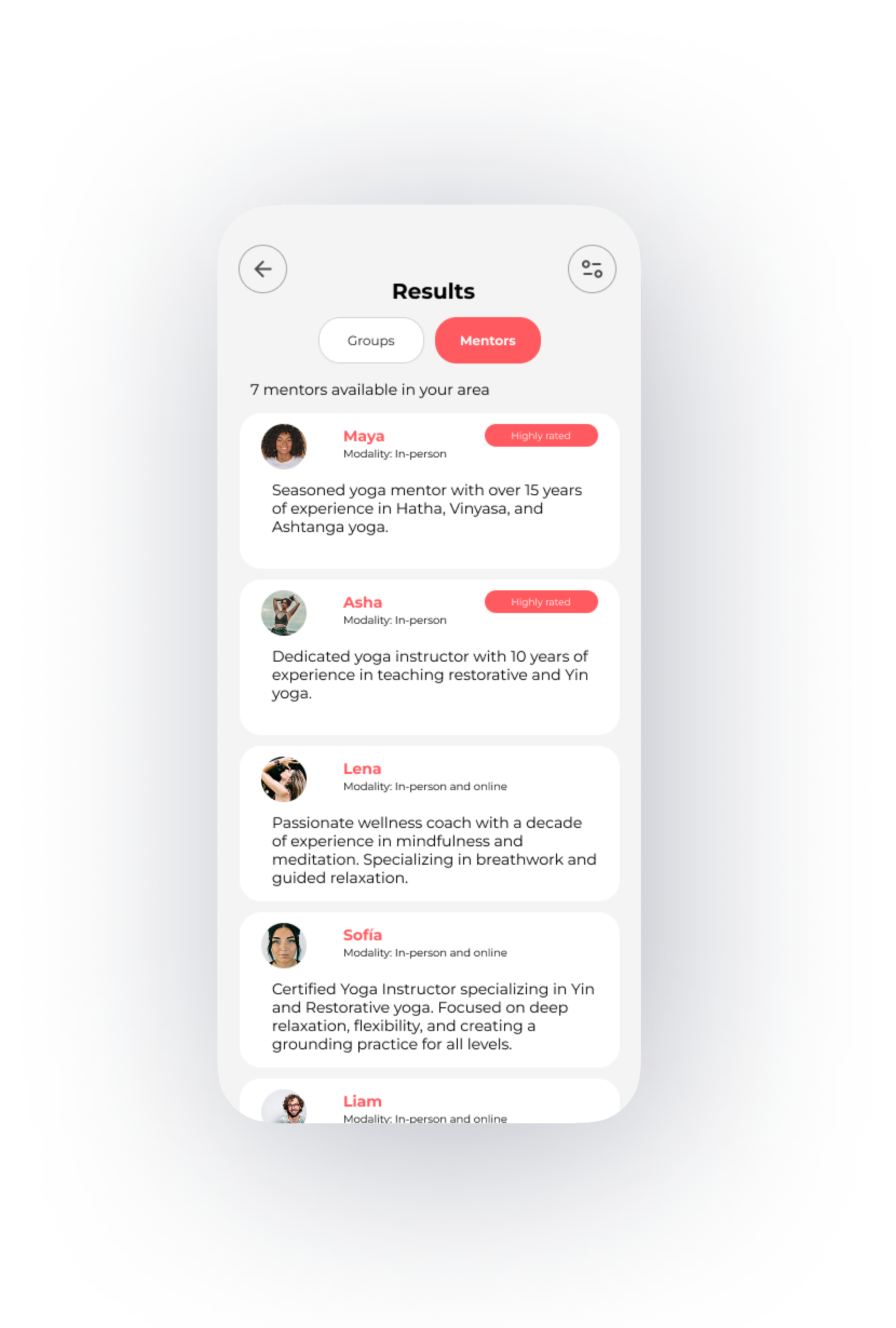
Participants mentioned a lack of key details in mentor and group profiles.
I enriched these sections with schedules, ratings, specializations, and bios, giving users the context they need to choose confidently.
02/ Added tags for produtcts
01/ Included more information about products
Users found it difficult to enter their location each time they opened the app.
Set the current location as default allowed users to immediately see nearby groups and mentors, streamlining the experience.
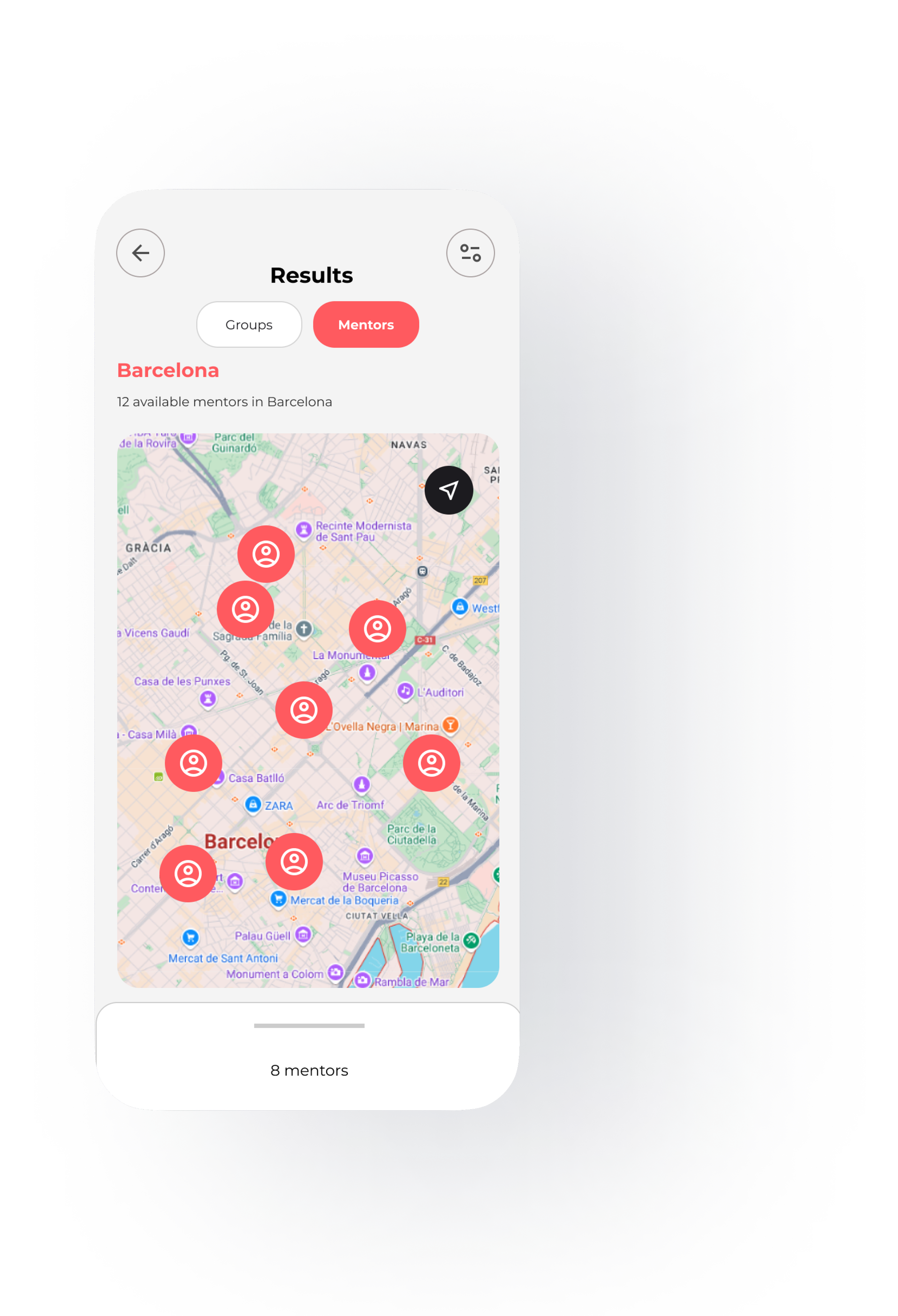
Users had trouble visualizing where each group or mentor was located.
I introduced a map view, showing nearby options and enabling better decision-making based on location and availability.